GERI TAPER

ARTIST BIO & STATEMENT
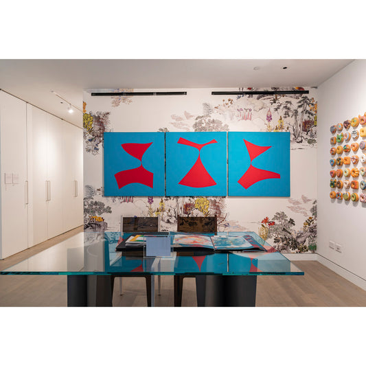
The late Geri Taper (1929-2004) is a painter whose simple forms and lively colors inspired by her admiration for classical music and movement effortlessly portray the strength of the human spirit. For more than 25 years, Taper's paintings have been involved with forms through color. The lyrical energy of form flows from one painting to the next with bold colors and forms changing shape from one to the next.
Geri Taper moved to New York City in 1976 from Pittsburgh where she had established herself as a leading artist, her career culminating in a show of large-scale works at the inaugural exhibition of the Sarah Scaife Gallery at the Carnegie Museum of Art. Drawn to the vitality and promise of an emergent Soho, for the next twenty years Taper vigorously pursued a career that included individual and group exhibitions at the city’s foremost galleries (David McKee, A.M. Sachs, Theodore Haber), foundation grants for special projects (New York Foundation for the Arts), commissions for the interior and exterior renovation of commercial and industrial properties in Long Island City (Falchi, Redstone Rocket and Center Buildings), and the design of a multi-colored banner at Queensboro Plaza Station sponsored by the New York City Metropolitan Transportation Authority (MTA).
Taper's work has been collected by such greats as Alice Tully (Lincoln Center), Agnes Gund (MoMA), and approximately 50 of her large “Red and Blue” series were collected by the Martha Graham Center of Contemporary Dance.

“I believe that we see not with our eyes, but with our vision.”
- Geri Taper
Artist Video: Geri Taper
- Choosing a selection results in a full page refresh.
- Opens in a new window.


